MISCELLANEOUS PROJECTS
DEWEY'S CORNER PUB
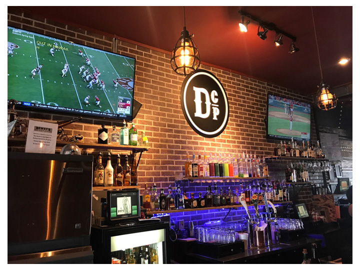
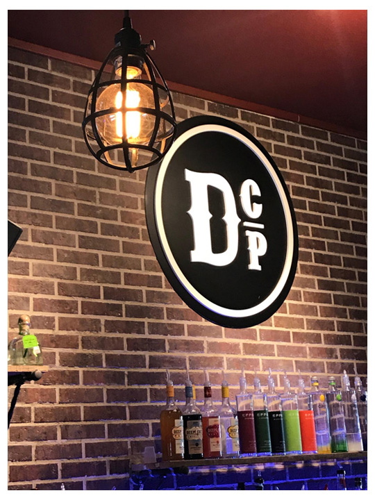
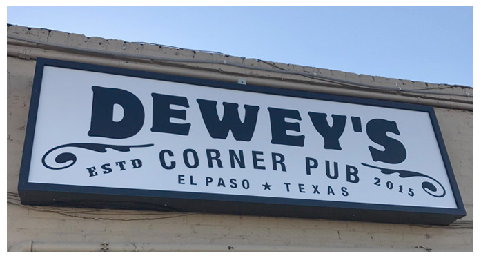
Dewey's Corner Pub approached us with a challenge of helping them brand a new local bar or "Pub". Their thought was to create an old timey feel and look. The logos had to be created with that in mind. The name was also a made up character, but in the owner's mind, the pub had to remind them of a much more simplified time and bygone era.
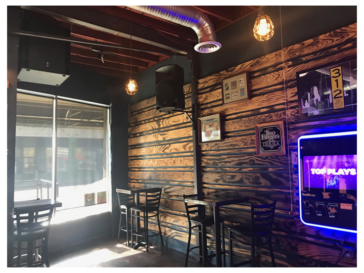
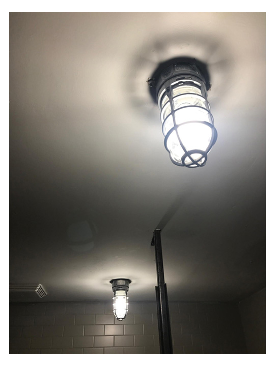
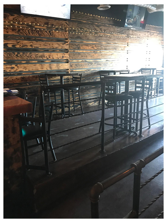
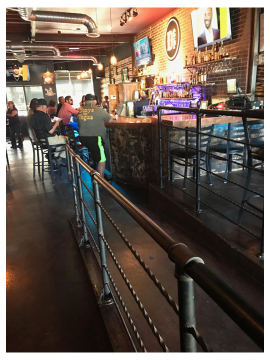
So we created the logo that felt older, but new at the same time. We designed the pub to mimic the whole industrial look and feel of the 20's which included using elements such as Edison style light fixtures, subway style tile work, lots of reclaimed style wood work, metal railings that were formed from plumbers pipes, colors that were more masculine. Even the bar shelving with it's brick and mortar wall backgrounds tied them all in perfectly. All these elements gave Dewey’s a warm comfortable relaxing feel.
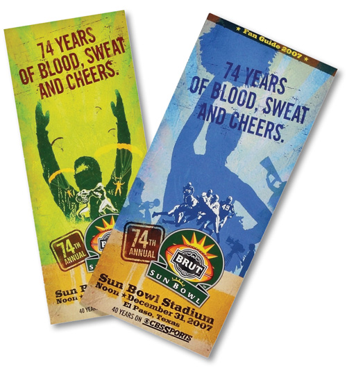
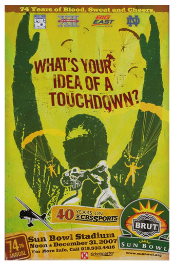
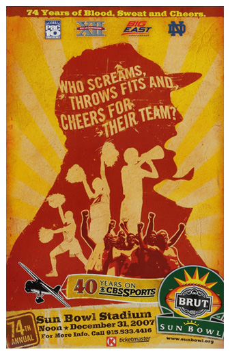
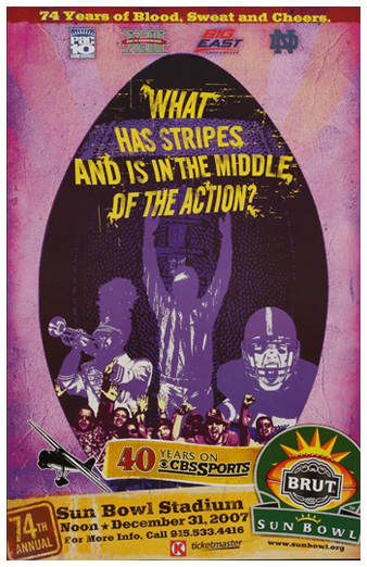
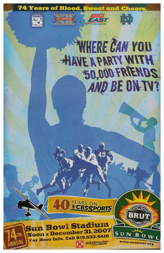
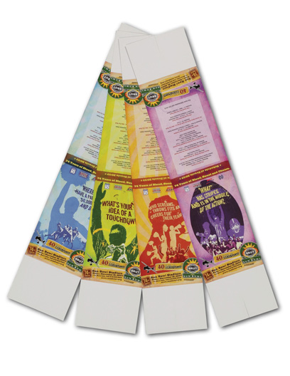
BRUT SUN BOWL ASSOCIATION – SPORTS HANDOUTS, POSTERS, TABLE TENTS
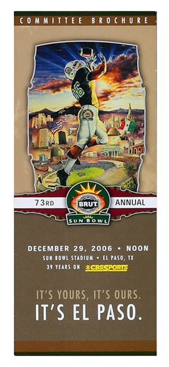
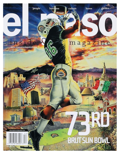
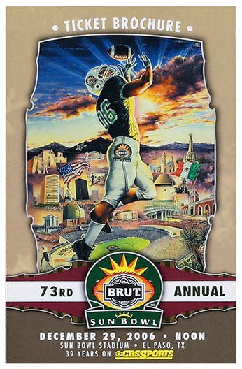
73RD BRUT SUN BOWL – COMMITTEE BROCHURE, POSTER, EL PASO MAGAZINE COVER
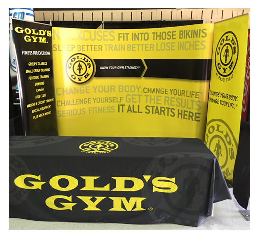
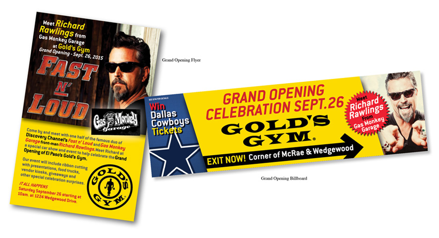
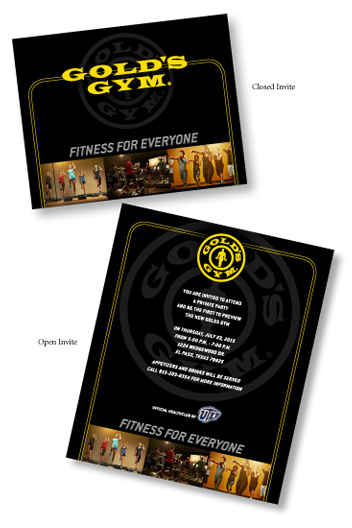
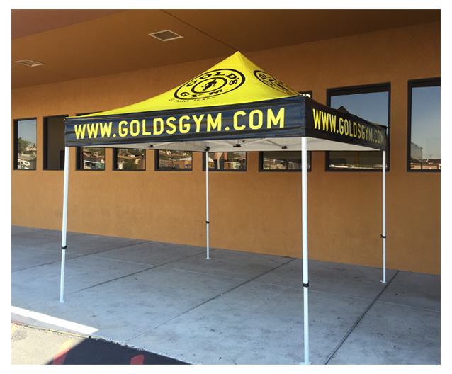
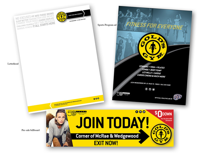
GOLD'S GYM MISCELLANEOUS PROJECTS – TRADE SHOW DISPLAY, TENT, MAILER CARDS, COLLATERAL, INVITE MOCK
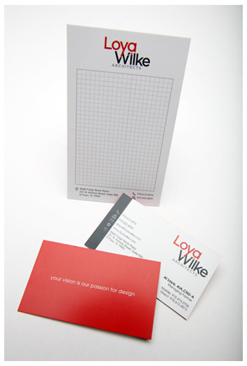
LOYA/WILKE ARCHITECTS – BUSINESS CARD AND NOTE PAD, HELMET LABELS, OFFICE SIGNAGE
PEPE'S TAMALES FACEBOOK TEASER ADS
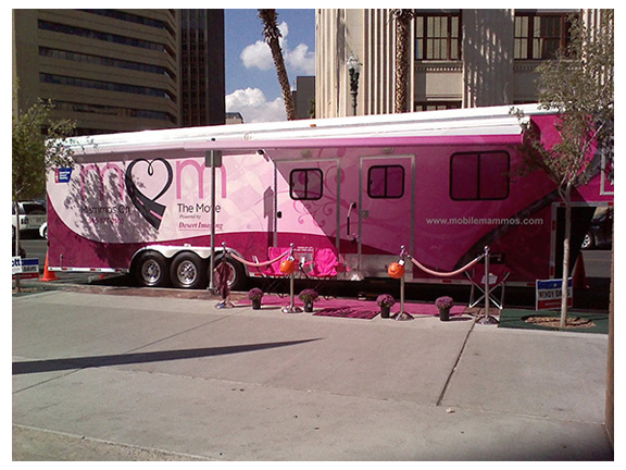
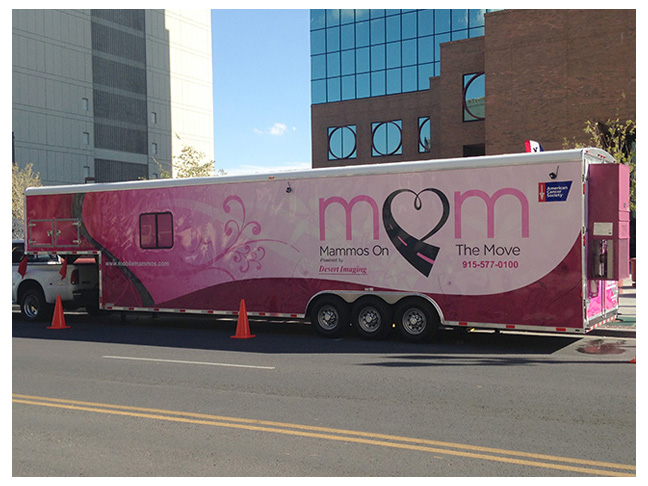
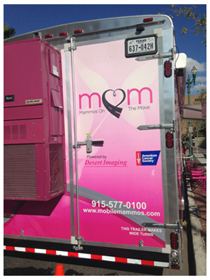
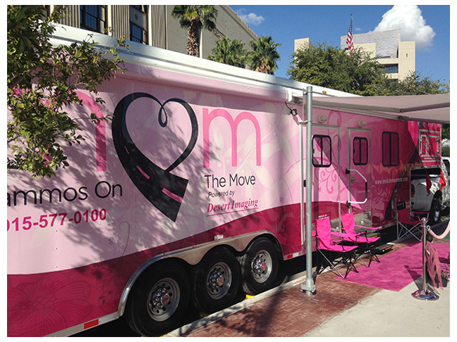
TRUCK WRAP GRAPHICS FOR MOM
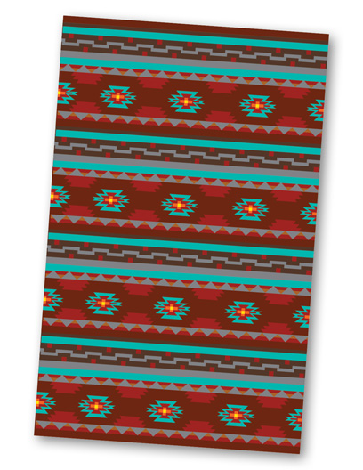
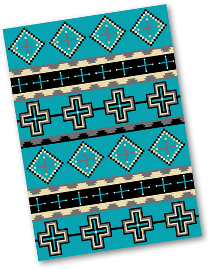
BEDSPREAD TEXTILE DESIGNS
